Model Checks, Model Selection, Multivariate Distributions
import pandas as pd
import numpy as np
from scipy import stats
import matplotlib.pyplot as plt
import seaborn as sns
import preliz as pz
from tqdm.auto import tqdm
import pymc as pm
plt.rcParams["figure.figsize"] = (15,3)
plt.style.use('ggplot')
np.random.seed(1337) # for consistency
Exercise 1: Negative Binomial Distribution Derivation
In this exercise you will reproduce the derivation of the negative binomial distribution.
a)
The negative binomial distribution gives the probability distribution
over how many failures are needed before successes are reached in a binomial experiment, with expectation and variance
Show that by setting the probability distribution becomes
with .
Hint: Use the definition of the binomial coefficient via factorials.
No solution, you should check by yourself whether you arrive at the correct result (see lecture slides).
The Poisson distribution is
For converging to the Poisson distribution for , the following properties need to be shown:
(known property of the exponential function, see e.g. Wikipedia)
c) Is it a conjugate family?
The Poisson likelihood forms a conjugated family with a Gamma prior distribution. Does the negative binomial distribution also form a conjugated family with a Gamma-distributed prior?
Negative binomial likelihood (use instead of because is already used in prior):
Gamma prior:
Resulting posterior:
This is not equal to the kernel of the Gamma distribution and consequently the negative binomial likelihood and the Gamma prior are not conjugated. We necessarily need to run MCMC to get samples from the posterior.
Exercise 2: More Toilet Paper Data
After your preliminary A/B study (previous exercise sheet), you collected a whole year of weekly data (toilet paper weight in kg) in order to give more precise predictions to the facility management so that they can plan their (reduced) budget better. The data are stored in toilet_paper_data.npy (you may load them with np.load()).
y_obs = np.load( "toilet_paper_data.npy" )
y_obs
array([165.5, 138.7, 139.7, 133.1, 156.4, 118.4, 166.9, 136.9, 149.8,
143. , 163.5, 121.3, 142.1, 141.4, 159.6, 132.8, 143.9, 135.5,
146.5, 153. , 132.8, 159.7, 156.8, 152. , 156.8, 137.8, 144.5,
134.8, 142.8, 152.4, 137.7, 141.2, 137.8, 135.9, 137.9, 145.8,
132.6, 148.8, 165.9, 154.9, 220. , 135.3, 137. , 166.3, 146.6,
138.4, 148.3, 171.2, 147.4, 153.4, 149.6, 141.8, 132.3])a) Simulate the posterior distribution
Like last time, you use a Normal likelihood and assume weak empirical Bayes priors for and : and where is the empirical mean and the empirical standard deviation of your data .
Simulate the posterior distribution with PyMC and visualize the marginal distributions and . What are the 90% highest density intervals for and ?
Empirical mean and standard deviation:
ybar = np.mean(y_obs)
sigmahat = np.std(y_obs, ddof=1)
Simulation:
with pm.Model() as tp_model_normal:
    μ = pm.Normal( 'μ', mu=ybar, sigma=sigmahat )
    σ = pm.Exponential( 'σ', lam=1/sigmahat )
    y = pm.Normal( 'y', mu=μ, sigma=σ, observed=y_obs )
trace_normal = pm.sample( 1000 )Marginal distributions and HDIs:
pm.plot_posterior( trace_normal, hdi_prob=0.9 )array([<Axes: title={'center': 'μ'}>, <Axes: title={'center': 'σ'}>],
dtype=object)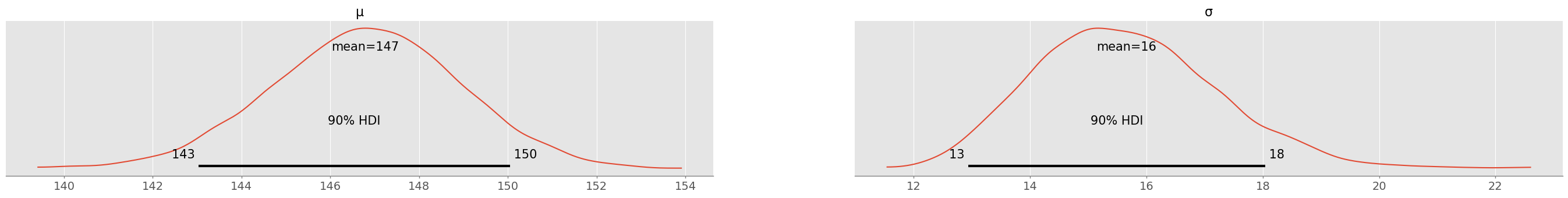
pm.summary( trace_normal, hdi_prob=0.9 )With 90% plausibility, is between 143-150 and is between 13 and 18 (values might change slightly after running the simulation with a different seed). After a full year of data, there is quite some (aleatoric) uncertainty remaining!
b) Visualize the Joint Distribution
Use pm.plot_pair() to also visualize the full joint distribution in a contour plot. Does the posterior look more or less (multivariate) normally distributed? Use np.cov() to compute the covariance matrix of the multivariate normal distribution. Are there strong correlations between and in the posterior?
Hint: np.cov() requires a numpy array with each variable (samples for and samples for ) as a column.
pm.plot_pair( trace_normal, kind="kde", figsize=(5,5), marginals=True )array([[<Axes: >, None],
[<Axes: xlabel='μ', ylabel='σ'>, <Axes: >]], dtype=object)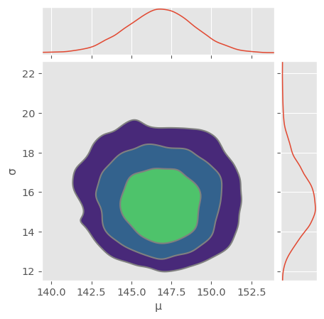
Looks normally distributed! Note that variances are not equal and you should actually see an ellipse if you turn on equal aspect ratio.
data = np.hstack( [trace_normal.posterior.μ.values.flatten().reshape(-1,1), trace_normal.posterior.σ.values.flatten().reshape(-1,1)] )
C = np.cov( data.T )
C
array([[ 4.5756726 , -0.17370283],
[-0.17370283, 2.51392661]])Covariance matrix is almost diagonal! That means there are almost no correlations between and also in the posterior!
Correlation matrix:
stdevs = np.sqrt(np.diag(C))
C / np.outer(stdevs, stdevs)
array([[ 1. , -0.0512157],
[-0.0512157, 1. ]])c) Compute samples from the predictive distribution
Compute samples from the predictive distribution using PyMC and use them to compute the root mean squared error (RMSE) and mean absolute error (MAE) averaged over your data and your predictive distribution as done in the lecture.
with tp_model_normal:
ppc_normal = pm.sample_posterior_predictive(trace_normal)Reshape predictions for broadcasting with Numpy:
ypred_normal = ppc_normal.posterior_predictive.y.values.reshape(-1,53)
ypred_normal.shape
(4000, 53)Compute differences:
eps_normal = ypred_normal - y_obsRMSE (in kg):
np.sqrt( np.mean( eps_normal**2 ) )np.float64(22.001847895618823)MAE (in kg):
np.mean( np.abs( eps_normal ) )np.float64(16.756911889753187)RMSE and MAE are quite different, this could indicate the presence of outliers in the data..
d) Perform a Posterior Predictive Check
You are not sure, whether using the normal distribution as likelihood (or sampling probability) was appropriate. To this end, perform a posterior predictive check as done in the lecture. Are the observed data within the range of typical predictions by the model? If not, what tendencies do you observe? What might be the reason for the discrepancy?
pm.plot_ppc( ppc_normal )<Axes: xlabel='y'>
The predictions (red) closely follow a normal distribution. However, the center of the observed data distribution is more to the left! There is an outlier present that can be quickly found (using e.g. a strip plot from seaborn):
sns.stripplot( y_obs )<Axes: >
This outlier appears to pull the estimate for a bit towards the right. This has not much influence on the estimated mean, but quite some on the estimated standard deviation:
np.std( y_obs, ddof=1 ), np.std( y_obs[y_obs<200], ddof=1 )(np.float64(15.44934205108168), np.float64(11.683511702453055))Exercise 3: Robust Estimation with Student’s T Distribution
(This exercise is a continuation of Exercise 1)
After asking back, the facility management tells you that there was a large conference with many external people in the building on one day (where you have the outlier in your data). You consider two different alternatives:
Remove the outlier and re-use the same normal model.
Keep the outlier and use a model that is capable of taking outliers into account.
Bayesians often prefer to be subjective in their choice of model but rather like to stay objective in their data. Modifications of data are always dangerous, since they are more difficult to document or reproduce than changes to the model.
a) Visualize the Student’s t distribution
You choose a Student’s t distribution as likelihood, since it is known to be more robust against outliers than the normal distribution. In addition to mean and standard deviation , the Student’s t distribution also has a parameter . In statistical t-tests, has typically a non-trivial interpretation as number of degrees of freedom. Here we take a simpler path and use to set the Student’s t distribution in relation with the normal distribution.
Use PreliZ visualisation functionality to compare different Student’s t distributions with the normal distribution. In particular, set and and use . For what limit of is the Student’s t distribution equal to the normal distribution? In what differs the Student’s t distribution from the normal distribution? Observe in particular also the tails of the different distributions.
Hint: Use the functions pz.StudentT(mu, sigma, nu).plot_pdf() and pz.Normal(mu, sigma).plot_pdf() and make sure the figure has an appropriate size (e.g. figsize=(8,6)) and region of interest (e.g. plt.xlim(-4,4)) so that the differences are clearly visible.
plt.figure( figsize=(8,6) )
for nu in [2,3,5,10,20]:
    pz.StudentT( mu=0, sigma=1, nu=nu ).plot_pdf()
pz.Normal( mu=0, sigma=1 ).plot_pdf( color="black" )
plt.xlim([-4,4])
(-4.0, 4.0)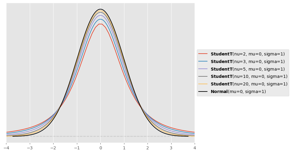
The Student’s distribution converges towards the normal distribution for large values of (so in theory for ). For smaller values of , the Student’s distribution has fatter tails than the normal distribution.
b) Modeling with Student’s t distribution
Repeat your modelling efforts from Exercise 1 using a Student’s t distribution as likelihood instead of a normal distribution. To this end, use a prior distribution for (that you should visualize beforehand). What are the 90% highest density intervals for , and ? From looking at , do you expect the resulting Student’s t likelihood to have much fatter tails than the previously used normal likelihood?
Prior for :
pz.Gamma(10,1.1).plot_pdf()<Axes: >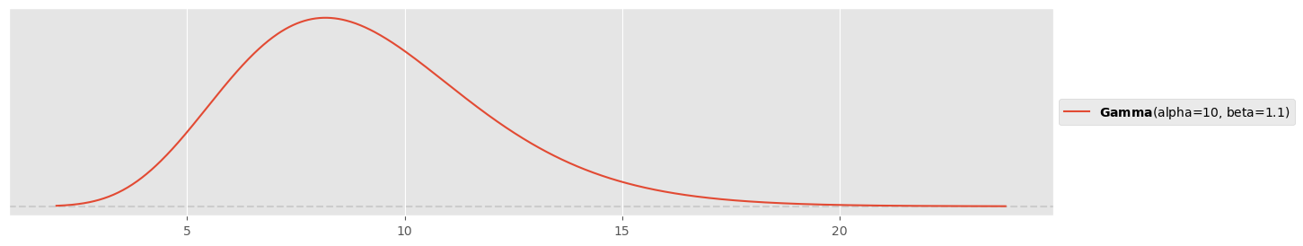
Simulation:
with pm.Model() as tp_model_studentt:
    μ = pm.Normal( 'μ', mu=ybar, sigma=sigmahat )
    σ = pm.Exponential( 'σ', lam=1/sigmahat )
    ν = pm.Gamma( 'ν', alpha=10, beta=1.1 )
    y = pm.StudentT( 'y', mu=μ, sigma=σ, nu=ν, observed=y_obs )
trace_studentt = pm.sample( 1000 )pm.plot_posterior( trace_studentt, figsize=(15,3), hdi_prob=0.9 )array([<Axes: title={'center': 'μ'}>, <Axes: title={'center': 'σ'}>,
<Axes: title={'center': 'ν'}>], dtype=object)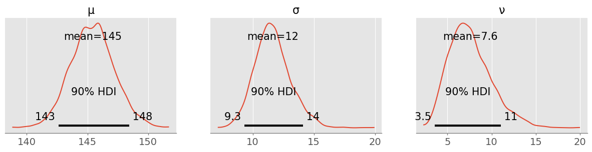
There is slightly less uncertainty in the mean and considerable less uncertainty in (that was by definition heavily influenced by the outlier)! is with 90% plausibility between 4 and 11, a considerable difference to a normal distribution with fatter tails:
plt.figure( figsize=(10,5) )
for nu in [4,6,8,11]:
    pz.StudentT( mu=0, sigma=1, nu=nu ).plot_pdf()
pz.Normal( mu=0, sigma=1 ).plot_pdf( color="black" )
plt.xlim([-4,4])
(-4.0, 4.0)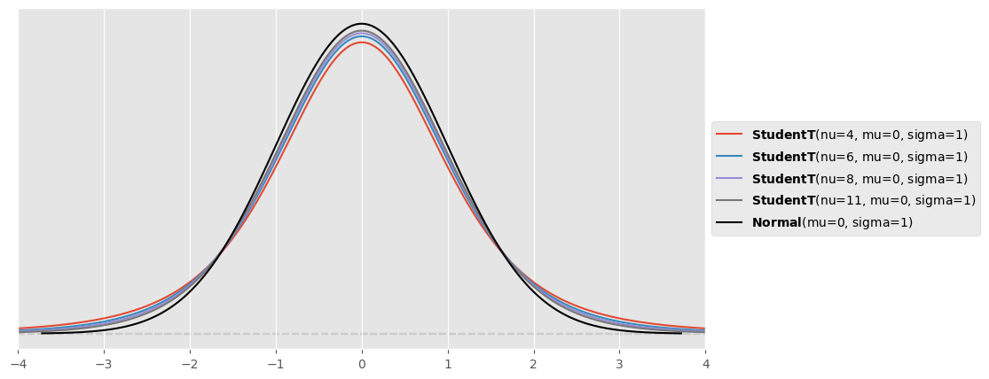
The fatter tails allow to accomodate the outlier there, while the normal distribution tries to bring the outlier more within its center.
c) Posterior predictive checks
Repeat the posterior predictive test that you did in Exercise 1 for your new model and compare it to the old one with normal likelihood. How do they differ?
with tp_model_studentt:
ppc_studentt = pm.sample_posterior_predictive(trace_studentt)fig, ax = plt.subplots(1, 2, sharey=True )
plt.sca( ax[0] )
pm.plot_ppc( ppc_normal, ax=ax[0] )
plt.xlim(80, 230)
plt.title("Normal likelihood")
plt.sca( ax[1] )
pm.plot_ppc( ppc_studentt, ax=ax[1] )
plt.xlim(80, 230)
plt.title("Student's t likelihood")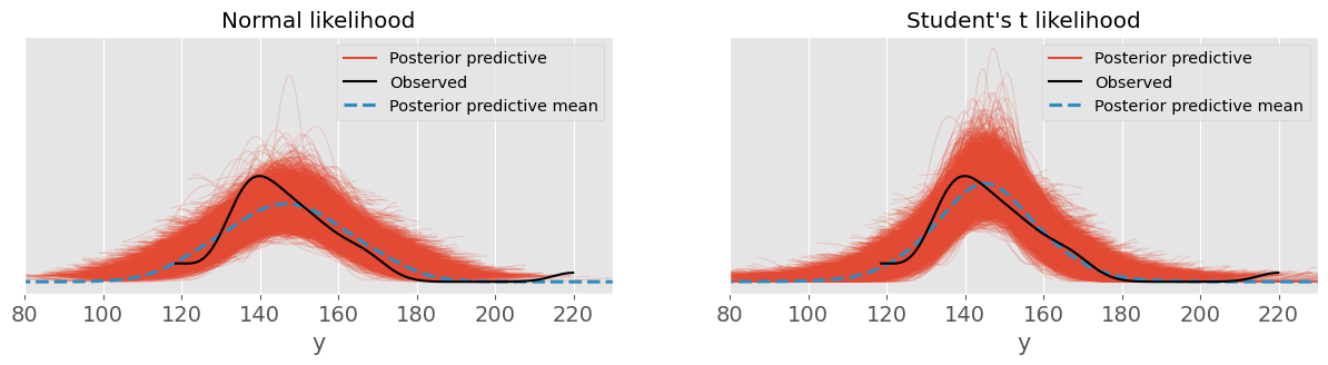
Student’s likelihood seems to make predictions quite a bit closer to the data distribution!
d) Compute RMSE and MAE
Compute again RMSE and MAE. What are the differences to Exercise 1 where a normally distributed likelihood was assumed? Were you expecting smaller or larger values compared to Exercise 1? What could be the reason that RMSE and MAE are not as much smaller as you wish them to be?
ypred_studentt = ppc_studentt.posterior_predictive.y.values.reshape(-1,53)
eps_studentt = ypred_studentt - y_obs
RMSE:
np.sqrt( np.mean( eps_studentt**2 ) )np.float64(20.834522351330023)MAE:
np.mean( np.abs( eps_studentt ) )np.float64(15.390502135330104)RMSE and MAE are now of almost equal size. However they are only a bit smaller. Choosing a more complex distribution (3 instead of 2 parameters) comes with more uncertainty in the parameters and consequently more predictive uncertainty for the same amount of data. Even though we have reduced the bias of the model (‘wrong’ normal likelihood assumption), we have now increased its variance by introducing an additional parameter.
e) Compare models
Compare both models (normal vs Student’s t likelihood) in terms of expected log predictive density (ELPD). Can you clearly favour one model of the other?
with tp_model_normal:
    pm.compute_log_likelihood(trace_normal)
loo_normal = pm.loo( trace_normal )(this warning is justified!!)
with tp_model_studentt:
    pm.compute_log_likelihood(trace_studentt)
loo_studentt = pm.loo( trace_studentt )df_comp_loo = pm.compare({'Normal Likelihood': loo_normal, 'Student\'s t Likelihood': loo_studentt})
df_comp_loopm.plot_compare(df_comp_loo);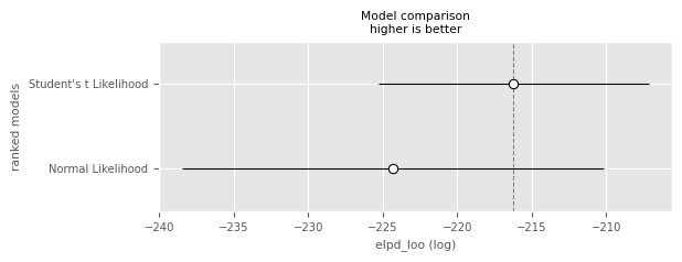
In terms of ELPD, the model with the Student’s likelihood is not significantly better (by the one-standard-error rule) than the model with the normal likelihood. This would probably change with more data and is due to the additional uncertainties (e.g. in the estimation of ).
Exercise 4: Railway Switch Maintenance
For resource planning (personnel and pre-stored material), SBB wants to assess how often their railway switches turn up defective and have to be maintained. To this end, they collected for 10 years the weekly counts of defective railway switches (fictitious data, stored in railway_switch_data.npy).
In this exercise you want to assess whether it is better to use a Poisson or a negative binomial likelihood for your Bayesian model. Since you know that models with more parameters typically pay a price in terms of additional uncertainty, you proceed very carefully.
y_obs = np.load( "railway_switch_data.npy" )a) Run posterior simulations
Run posterior simulations for two models:
A model with Poisson likelihood and a prior on , where is the empirical data mean and the empirical standard deviation.
A model with negative binomial likelihood with the same prior on and a prior on .
Quickly visualize the priors used before the simulation—do they make sense for you? Visualize the marginal posterior distributions of the involved parameters and assess their uncertainty. Hint: PyMC does not use exactly the same parameter names for the prior distributions as used here and in the lecture. Make sure you find the correct mappings.
Poisson likelihood model:
pz.Normal( mu=np.mean(y_obs), sigma=np.std(y_obs) ).plot_pdf()<Axes: >
with pm.Model() as poisson_model:
    lbd = pm.Normal( 'lbd', mu=np.mean(y_obs), sigma=np.std(y_obs) )
    y = pm.Poisson( 'y', mu=lbd, observed=y_obs )
trace_poisson = pm.sample( 1000, chains=4 )pm.plot_posterior( trace_poisson )<Axes: title={'center': 'lbd'}>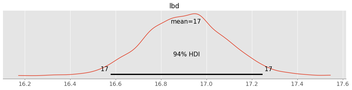
Negative binomial likelihood model:
pz.Gamma( alpha=2, beta=0.1 ).plot_pdf()<Axes: >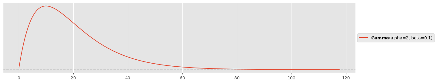
with pm.Model() as negbin_model:
    lbd = pm.Normal( 'lbd', mu=np.mean(y_obs), sigma=np.std(y_obs) )
    r = pm.Gamma( 'alpha', alpha=2, beta=0.1 )
    y = pm.NegativeBinomial( 'y', mu=lbd, alpha=r, observed=y_obs )
trace_negbin = pm.sample( 1000, chains=4 )pm.plot_posterior( trace_negbin )array([<Axes: title={'center': 'lbd'}>, <Axes: title={'center': 'alpha'}>],
dtype=object)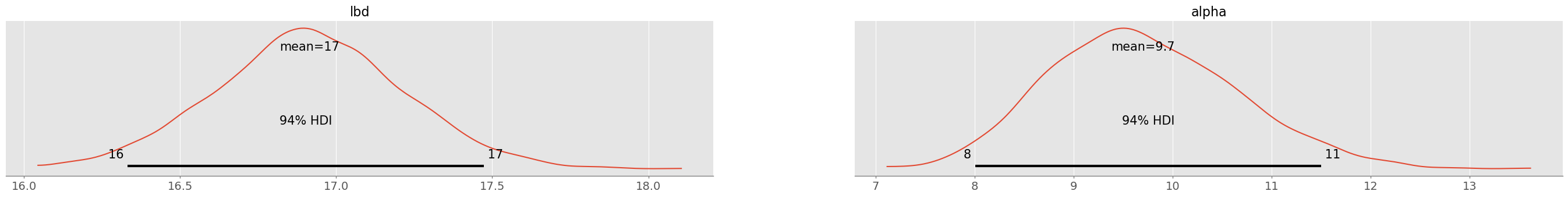
pm.plot_pair( trace_negbin, kind="kde", figsize=(6,6) )<Axes: xlabel='lbd', ylabel='alpha'>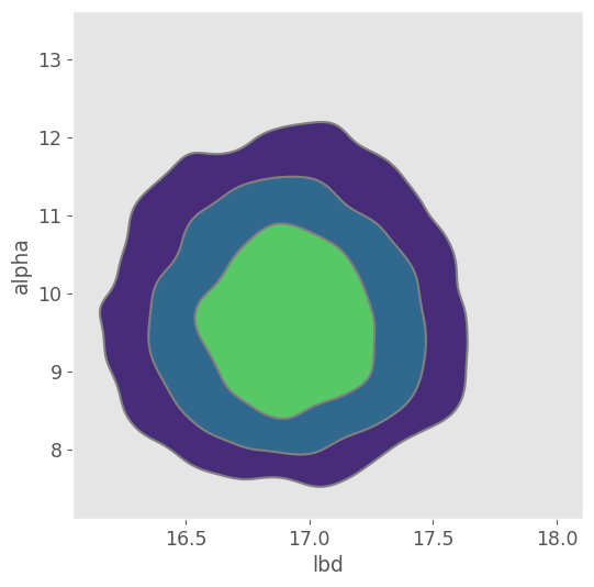
Again the joint posterior distribution looks normally distributed!
b) Perform a posterior predictive check
Perform a posterior predictive check of both models and plot the side-by-side. Which model do you prefer after the posterior predictive check?
Posterior predictions:
with poisson_model:
    ppc_poisson = pm.sample_posterior_predictive(trace_poisson)

with negbin_model:
ppc_negbin = pm.sample_posterior_predictive(trace_negbin)Posterior predictive checks:
fig, ax = plt.subplots(1, 2, sharey=True )
plt.sca( ax[0] )
pm.plot_ppc( ppc_poisson, ax=ax[0] )
plt.title("Poisson likelihood")
plt.sca( ax[1] )
pm.plot_ppc( ppc_negbin, ax=ax[1] )
plt.title("Negative binomial likelihood")
The negative binomial likelihood seems much better suited to model the data!
c) Compute Bayes factors
Compute the Bayes factor between the marginal likelihoods for the two models. Which model explains the data better in your belief? Also try to compute the marginal likelihoods and . Would you expect that they are so extremely small?
Hint: Use SMC as introduced in the lecture and the companion notebook.
with pm.Model() as poisson_model_smc:
    lbd = pm.Normal( 'lbd', mu=np.mean(y_obs), sigma=np.std(y_obs) )
    y = pm.Poisson( 'y', mu=lbd, observed=y_obs )
trace_poisson_smc = pm.sample_smc( 2000, chains=4 )with pm.Model() as negbin_model_smc:
lbd = pm.Normal( 'lbd', mu=np.mean(y_obs), sigma=np.std(y_obs) )
r = pm.Gamma( 'alpha', alpha=2, beta=0.1 )
y = pm.NegativeBinomial( 'y', mu=lbd, alpha=r, observed=y_obs )
trace_negbin_smc = pm.sample_smc( 1000, chains=4 )lpd1 = trace_poisson_smc.sample_stats.log_marginal_likelihood.mean().values
lpd2 = trace_negbin_smc.sample_stats.log_marginal_likelihood.mean().values
BF = np.exp( lpd2 - lpd1 )
lpd1, lpd2, BF(array(-1946.6099806),
array(-1757.12056159),
np.float64(1.968833791064198e+82))It is beyond any discussion that the negative binomial model is better suited (BF=1082..)
The marginal probabilities are extremely small!
np.exp(lpd1)np.float64(0.0)np.exp(lpd2)np.float64(0.0)This is the reason why we work with log probabilities, to at least being able to evaluate the Bayes factor. The marginal probabilities are so small because they are the product of the probabilities of all data points under the posterior distribution:
Imagine each data point has on average 80% probability under the model (which is high). Then the resulting marginal probability is
0.8**len(y_obs)4.342032859091343e-52extremely small values are to be expected!
d) Compare models
Compare the models in terms of ELPD. Is there a clear winner when involving the one-standard-error rule?
with poisson_model:
    pm.compute_log_likelihood(trace_poisson)
loo_poisson = pm.loo( trace_poisson )with negbin_model:
pm.compute_log_likelihood(trace_negbin)
loo_negbin = pm.loo( trace_negbin )df_comp_loo = pm.compare({'Poisson Likelihood': loo_poisson, 'Negative Binomial Likelihood': loo_negbin})
df_comp_loopm.plot_compare(df_comp_loo);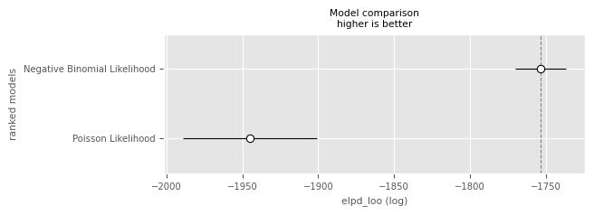
Clearly it is recommended to use the negative binomial model! This time we have enough data to reduce the uncertainty of the additional parameter.
e) Compute predictive RMSE and MAE
Compute predictive RMSE and MAE for both models and compare them.
ypred_poisson = ppc_poisson.posterior_predictive.y.values.reshape(-1,530)
ypred_negbin = ppc_negbin.posterior_predictive.y.values.reshape(-1,530)
eps_poisson = ypred_negbin - y_obs
eps_negbin = ypred_poisson - y_obs
RMSE:
rmse_poisson = np.sqrt( np.mean( eps_poisson**2 ) )
rmse_negbin = np.sqrt( np.mean( eps_negbin**2 ) )
rmse_poisson, rmse_negbin
(np.float64(9.658274558782754), np.float64(7.9643295267913645))MAE:
mae_poisson = np.mean( np.abs( eps_poisson ) )
mae_negbin = np.mean( np.abs( eps_negbin ) )
mae_poisson, mae_negbin
(np.float64(7.595762735849057), np.float64(6.296092924528302))Both negative binomial RMSE and MAE are a bit smaller!
Exercise 5: Estimating Churn Proportions
You work at a national health insurance company. Recently, significantly more customers than usual have terminated their insurance policies with your company and changed to somebody else. In the insurance jargon, the number of customers terminating their contract is called churn. The management has ordered an investigation that was carried out by the sales department: they have tried to contact 200 customers that have left and asked them about the reason why they had terminated their contract. They could actually reach 150 customers and out of these 112 gave a suitable answer. Finally, the sales departement has put the different churn reasons into three main categories:
premium (‘prämie’) too high ( cases)
unsufficient coverage ( cases)
unsuitable insurance models ( cases)
As a data scientist, you are aware that this is a restricted sample and decide to use a Bayesian model with multinomial likelihood and flat Dirichlet prior to model the true underlying proportions , and of your entire insurant population including uncertainty.
a) Simulate the posterior
Simulate the posterior with PyMC and visualize the marginal posterior distributions of , and . What 90% HDIs can you communicate back to the management? Formulate a sentence.
observed_counts = [82, 24, 6]

rng = np.random.default_rng(123)

with pm.Model() as churn_model:
    pi = pm.Dirichlet( 'pi', a=[1,1,1] )
    y = pm.Multinomial( 'y', n=np.sum(observed_counts), p=pi, observed=observed_counts )
trace = pm.sample(1000, random_seed=rng)pm.plot_posterior( trace, figsize=(15,2), hdi_prob=0.8 );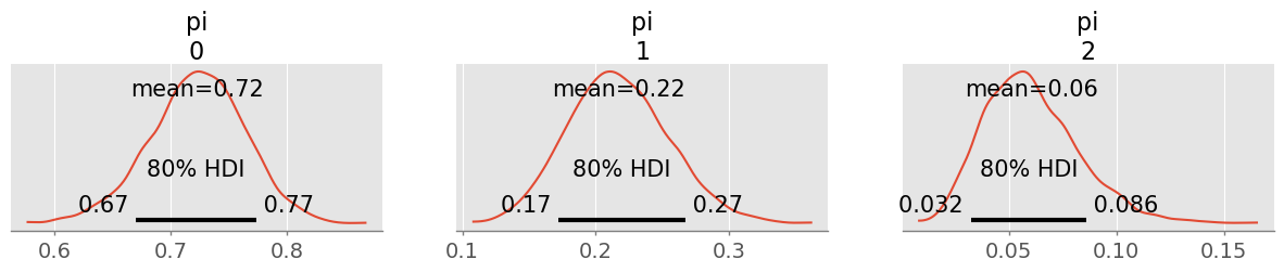
I believe to 90% that for around 67-78% of the churn customers the premium is too high, for around 17-27% the coverage was unsufficient and around 0.03-0.09% found our insurance models unsuitable.
b) Use the Dirichlet-multinomial conjugacy
Use Dirichlet-multinomial conjugacy and Preliz to visualize your posterior on a probability simplex.
alpha = np.array([1,1,1])
pz.Dirichlet( alpha + observed_counts ).plot_pdf( marginals=False )
<Axes: title={'center': '$\\bf{Dirichlet}$(alpha=[83. 25. 7.])'}>
c) Switch to a different prior
Your superior is unsure about your results. She says: “It’s very typical that people switch contracts because of the premium. I would have used a Dirichlet ([10,1,1]) prior that reflects this.”
Use Preliz to visualize this prior on a simplex and marginalized (to look at specifically) and compute the prior mean and standard deviation for . Finally, re-run your simulation and show that your results are still pretty similar and that your posterior is quite insensitive to this choice of prior.
pz.Dirichlet( [10,1,1] ).plot_pdf( marginals=False )<Axes: title={'center': '$\\bf{Dirichlet}$(alpha=[10. 1. 1.])'}>
pz.Dirichlet( [10,1,1] ).plot_pdf()array([<Axes: >, <Axes: >, <Axes: >], dtype=object)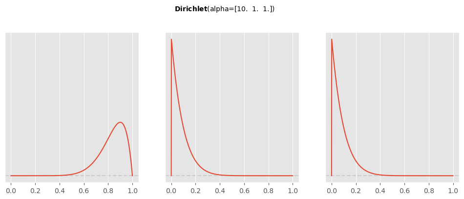
pz.Dirichlet( [10,1,1] ).summary()Dirichlet(mean=array([0.83333333, 0.08333333, 0.08333333]), std=array([0.10336228, 0.07665552, 0.07665552]))with pm.Model() as churn_model:
pi = pm.Dirichlet( 'pi', a=[10,1,1] )
y = pm.Multinomial( 'y', n=np.sum(observed_counts), p=pi, observed=observed_counts )
trace = pm.sample(1000)pm.plot_posterior( trace, figsize=(15,2), hdi_prob=0.8 );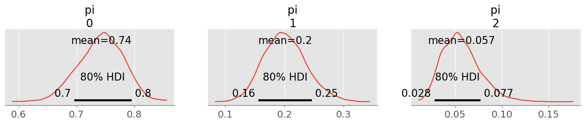
90% HDIs are only changed by a few percent! This will not have a big impact on my communication.
Exercise 6: The Multivariate Normal Distribution
Even though the multivariate normal distribution plays a big role in Bayesian inference, it will not play a major role in the first part of this lecture, since the bambi library does everything for us in hiding complexity. However, the multivariate normal distribution will become more important, when you will work with Gaussian processes in the second half.
The following three exercises are meant to get to know the multivariate normal distribution a little bit better.
a) The multivariate normal distribution
Load the credit rating data (from credit_data.csv in the exercise materials) and select ‘Income’ as and ‘Rating’ as . Compute (classical) estimators for and the covariance matrix . Visualize the resulting normal distribution using a contour plot and overplot with the data. Ponder (qualitatively) whether the normal distribution is a good model for this data.
Hints: You may use np.cov() to compute the covariance and code in the notebook ‘week5_multivariate_distributions.ipynb’ to produce the contour plot.
credit_data = pd.read_csv("data/credit_data.csv")
credit_data.head()Compute means and covariance:
mu = credit_data[["Income", "Rating"]].mean().values
mu
array([ 45.218885, 354.94 ])cov = np.cov( credit_data[["Income", "Rating"]].values.T, ddof=1 )
covarray([[ 1242.15879093, 4315.49294045],
[ 4315.49294045, 23939.56030075]])Plot contour and data (removed equal axis dimensions to make the plot a bit more appealing):
# from notebook "week5_multivariate_distributions.ipynb"
def plot_mvnormal( mu, cov, xrange=[-3,3], yrange=[-3,3], ax=None ):

    # setup grid
    x = np.linspace(xrange[0], xrange[1], 1000)
    y = np.linspace(yrange[0], yrange[1], 1000)
    X, Y = np.meshgrid(x, y)

    # multivariate normal
    Z = stats.multivariate_normal( mean=mu, cov=cov ).pdf( np.dstack((X, Y)) )

    # create plot
    if ax is not None:
        plt.sca(ax)

    CS = plt.contour(X, Y, Z, levels=20)
    #plt.gca().set_aspect("equal");
xmin = 0
xmax = credit_data.Income.max() * 1.1
ymin = 0
ymax = credit_data.Rating.max() * 1.1
plot_mvnormal( mu, cov, xrange=[xmin, xmax], yrange=[ymin, ymax] )
credit_data.plot.scatter(x="Income", y="Rating", c="red", ax=plt.gca())<Axes: xlabel='Income', ylabel='Rating'>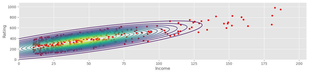
b)
Show that if and , then
Hints: Compute and and use linearity in the first and that for independent and .
c)
Let be a random vector. Show that
Hints: Compute and use linearity. Compute and use that and .